The
job of a good book cover is to make you pick up the book and flip it over to
read the back cover. Or click on it to read the blurb. It does that by
attracting the eye and providing the right “symbols” to clue you into the
book’s genre. If you see a good-looking man and woman on the cover, you would
be forgiven for assuming that the book’s a romance. If the man and woman are
scantily clad and posed provocatively, it’s probably safe to assume the story
contains hot and heavy sex scenes.
As an
indie writer, I create almost all my covers. I (usually) enjoy the challenge
and I can’t afford to hire a graphic designer for each cover. I mean, really, it
would be embarrassing if the graphic designer earned more money on the story
than I did.
I know,
however, that a bad cover can spell disaster. I also know that “good” and “bad”
are subjective. For example, the cover for The
Mount by Carol Emshwiller. I had never heard of Ms. Emshwiller when I
received her book as part of a goodie bag at a World Fantasy Convention. I
looked at it among the 20 or so other books I received and was turned off by
the cover. Still, I brought it home. It sat in my bookshelf for years. Every
once in a while, I pulled it down and read the cover blurb and then put it
back. I just couldn’t get past that ugly (to me—someone else might really like
it) cover. Finally, desperate for something, anything, to read, I started reading it.
Well,
hot damn. It was a great story—I could NOT put it down. But that cover had put me off
so much that I didn’t get to the story for years.
That cover failed to do what it was supposed to do, as far as I’m concerned.
While
cover art is subjective, a good graphic designer can create a cover that has
great appeal. But what if you’re an amateur, like me? You study the genre
you’re aiming for. What do those covers look like? What elements do they have
in common? Any colours that predominate? Then, trial and error.
When
Carina published my first Mendenhall Mystery, The Shoeless Kid, they used the wonderful John Kicksee
as the artist. To say I was blown away by the cover is an understatement. When
I decided to continue the series as an indie writer, I knew I wanted to carry
on John’s vision. I knew I needed elements of mystery, without going too dark,
but I also wanted to carry through the style of title and byline that John had
used on Shoeless. What I ended up
with was not as gorgeous as John’s original cover, but at least the covers look
like they belong in the same series:


Every
once in a while, however, imagination fails me and I can spend weeks (if not
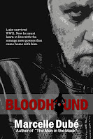
months) on a single cover, trying to get it right. “Bloodhound” was published
as part of the Superhero Universe: Tesseracts Nineteen anthology. I wanted to
put the individual story up for sale, but it needed a cover. Do you think I
could find an appropriate image? It was like pulling teeth. The story revolves
around a young man who was injured at Antwerp, during World War II. The injury
left him with asnomia, or the loss of his sense of smell. Once back home, a
series of events reverses the effect, and then some.
I
fooled around with ideas for weeks, trying and rejecting, with kind friends
looking the trial covers over and reacting with “no” to “hell, no!” Here are two of the
“best” that got the “uh, no” reaction:
And
here’s what I finally ended up with. It may not be perfect, but at some point
you have to say, enough, and move on:
What
about you? Do you create your own covers? How do you go about it? Any tips…?


8 comments:
Marcelle, I've known right along that you could write, but I never knew you were an artist too. Your covers are AWESOME! Good for you.
I like the cover you ended up with. I wish I had the talent to make a cover! :) (And after looking at the cover of The Mount, I can see why you put off reading it for so long!)
Thanks, Jean. I'm not sure anyone else would call me an artist, but I'll take it!
Anne Marie, in my case it's more desperation than talent. :-)
The cover you finally decided on is great. You are one talented woman.
::blush:: Thanks, Elise.
Covers - and blurbs - are (I swear) the hardest part of writing the book!
Great job on the new cover evolution
Thanks, Cathy. You're absolutely right -- covers and blurbs will be the death of me!
Post a Comment